This class introduced us to the use of digital tools for the purposes of making often analog history more accessible or otherwise more informative.
Omeka is an online platform designed for showcasing digital exhibits in history. I have created a small exhibit highlighting the details of the landmark Supreme Court case Schenck v. United States regarding a citizen’s prosecution for violating The Espionage Acts Of 1917 And 1918.
http://amanda-regan.com/digitalprogressiveera/exhibits/show/schenck-v–united-states
In keeping with that theme, I have created a timeline of significant Supreme Court cases throughout the Progressive Era and beyond – largely comprised of issues that Justice Oliver Wendell Holmes, Jr. held opinions on. This timeline was created using Knight Lab timeline.js. It is a simplified interface that allows one to create attractive and simple timelines using only a Google spreadsheet to enter the information.
The software allows one to enter as many items as needs linking to relevant media files and publishes them in an out-of-the-box timeline solution.
Often, in the interest of analysis, one finds they have a lot of information that cannot be successfully communicated in a mere table. Airtable is an online repository for creating public relational databases to accommodate clunkier data. While not a true relational database engine, it has the capabilities of doing the job.
For my purposes, we took information gathered from various news sources of the era and collated data regarding suffrage demonstrations and turnout. Using this, we were able to analyze turnout by city and time as it led up to the passage of the 19th Amendment in 1920. That database follows from the link below.
https://airtable.com/tblpHRFMfky5aOSsf/viworwbQ4QTG3KSdI?blocks=hide
Text mining was perhaps the most interesting or at least the most fruitful of these tools to analyze large sets of legacy data. Voyant Tools offers a free online service to create custom analysis of text collections. Using eleven issues of “The Woman Citizen” from June thru August of 1918, I have performed a cursory textual analysis of the issues with the hopes of gleaning matters of substance from the time. Measured against what we know from close readings of the material and what we know about time as fact, one can reliably assess the usefulness of such data mining practices and their application in the humanities.
Other visualizations include trend graphs and bigrams.
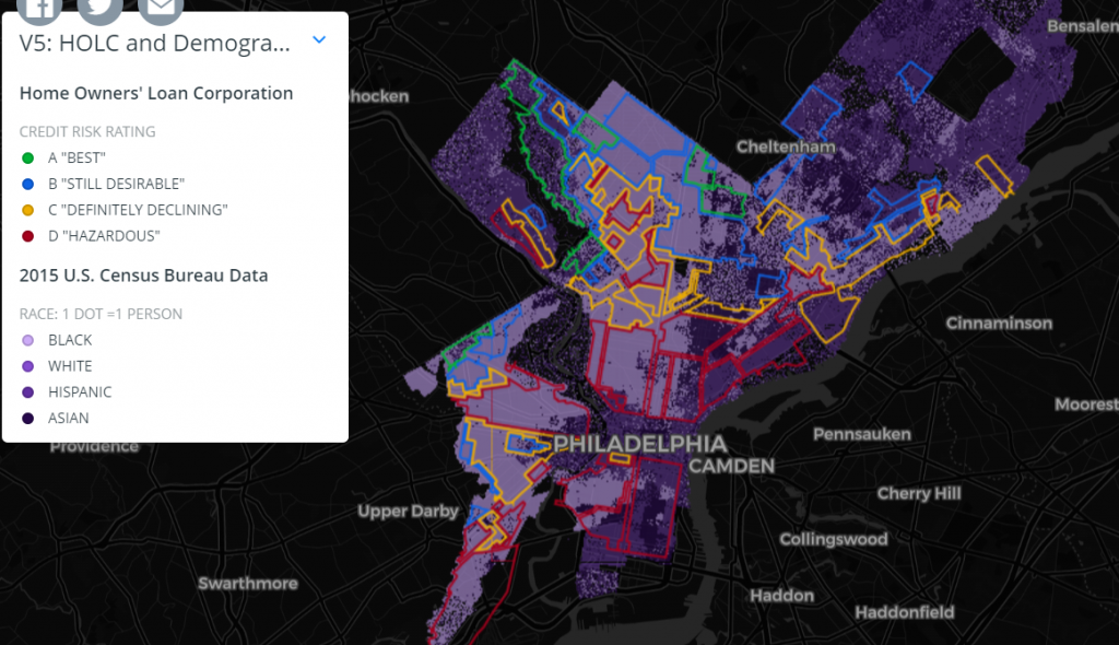
kepler.gl is an online mapping interface that allows you to transform a list of longitude and latitude coordinates into a multilayered interactive map. Using a copy of “The Negro Motorist Green Book” from 1940, I cataloged the entries for Philadelphia at the time. The list includes five garages, fifteen barbershops and beauty salons, eighteen hotels, two nightclubs, two restaurants and nine taverns for a total of fifty-one total businesses listed.
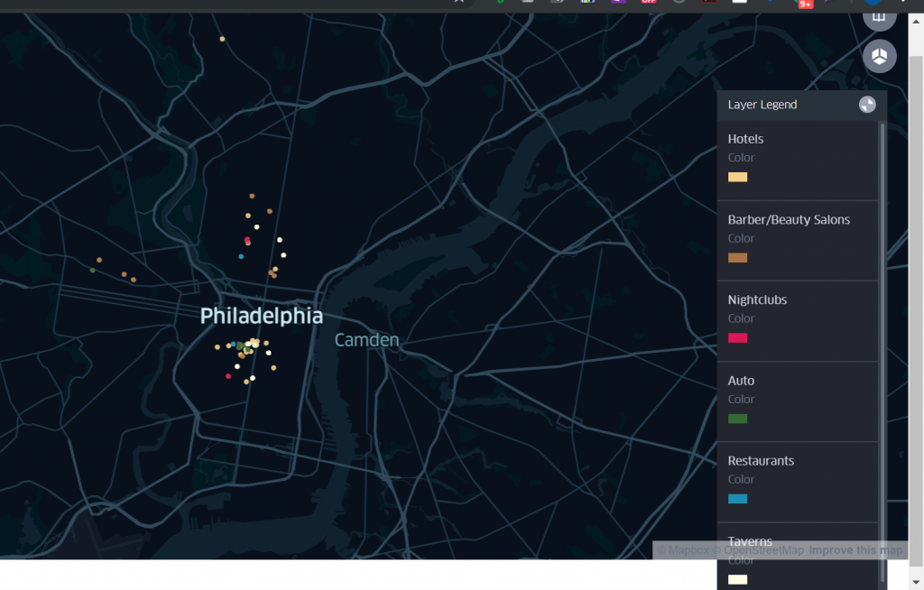
Comparing this with redlined maps from the era, one gets a sense of the segregation imposed by such policies.
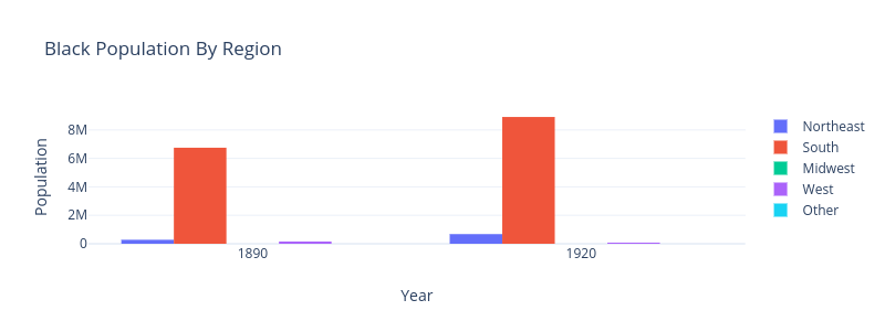
I was curious if we would see a black migration from the South in these 20 and 50 years after the civil war. I expected to see some westward and northward migration. Using Plotly, I analyzed some census data expecting to see a migration of black North and West after the War. Below are graphs of total population for the regions.
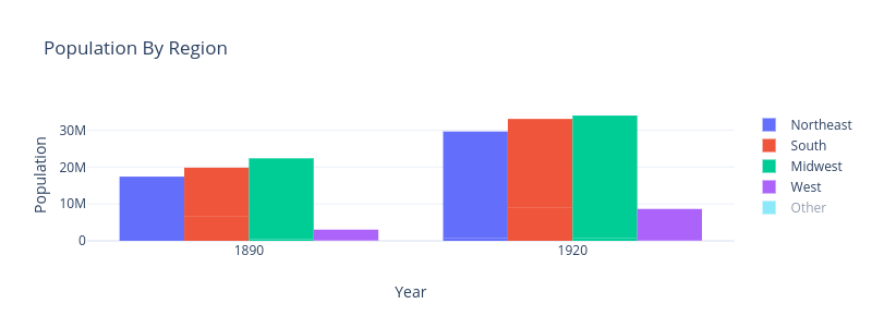
As I said, I expect a mass migration. It was not the case.
These various tools illustrate a number of ways that technology can make this history not only easier to consume, but more interesting and more informative as well. List of facts, figures, data and coordinates do not tell a story. However, using some of the tools I have highlighted, a richer story can be told.